From Ana Tudor’s Mastadon post. The code can be found on Codepen.
It isn’t rendering here in an HTML block very well, so you can click this link to see the full effect.
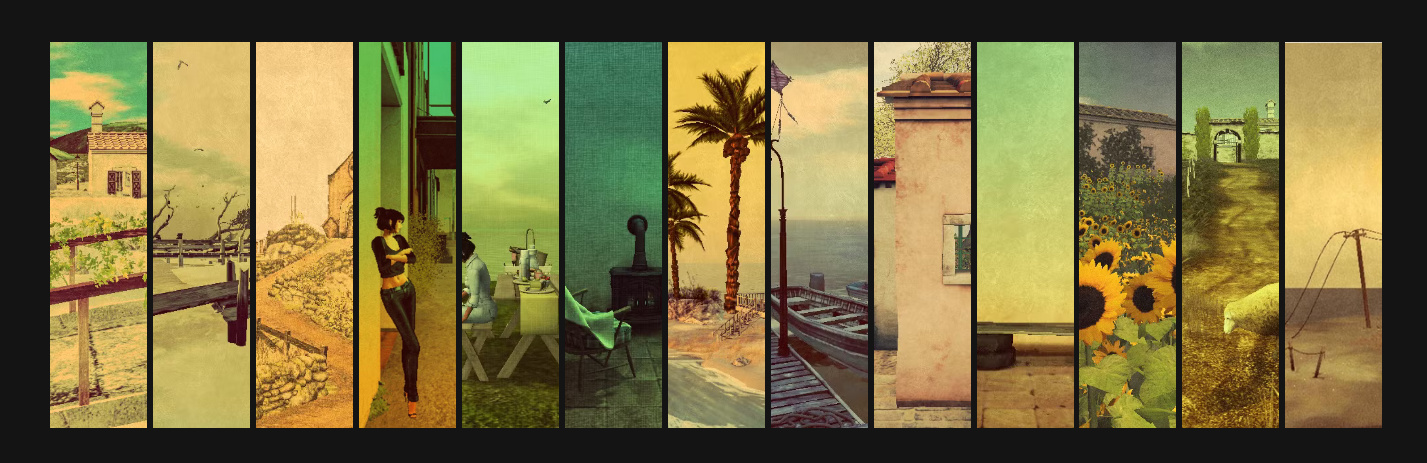
This is from Ana Tudor’s Mastadon post and the original code can be found on Codepen. The author was inspired by this Codepen post. That post required you to split your image into multiple pieces. Which is fine if you want an artistic effect like the original, seen below. But if you want to split the image up into equal parts, so you can see the entire image but have it presented as a 3D wave, Ana Tudor’s code is much better because it handles that for you.
This is the full code used at the top of the page. It is running in an HTML block so I combined all of the HTML and CSS into a single block. I did not remove any of the original author’s comments. The only thing changed was the photo that is displayed.
Something in the WordPress is preventing the image for distorting correctly, I’ll address that later. Click this link to see the code running as intended.
					<style>
  html,
  body,
  div {
    display: grid
  }

  html,
  body {
    grid-template-columns: 100%;
    width: 100%;
  }

  html {
    height: 100%
  }

  body {
    overflow-x: hidden;
    margin: 0;
    perspective: 50em;
    background: #121212
  }

  .wrap {
    grid-auto-flow: column;
    place-self: center;
    transform-style: preserve-3d
  }

  .item {
    --u: (1.5vmin + .5vmax);
    /* limit amount of items affected by hover on each side */
    --lim: round(up, var(--n)/3, 1);
    /* index difference between hovered & current item */
    --dif: calc(var(--k) - var(--i));
    --abs: abs(var(--dif));
    /* its absolute value */
    /* is item affected by hover (moving)? yes 1, no 0 */
    --mov: clamp(0, var(--lim) - var(--abs), 1);
    /* amplitude of cosine wave */
    --amp: 5*var(--u)*var(--mov);
    /* angle current item is at on cos curve rel to hovered */
    --ang: var(--mov)*var(--dif)/var(--lim)*180deg;
    /* angle of tangent to curve at midpoint of current item */
    --rot: atan(-1*sin(var(--ang)));

    padding: .375rem;
    width: calc(3*var(--u));
    aspect-ratio: 1/ 5;
    translate: 0 0 calc(var(--mov)*var(--amp)*(1 + cos(var(--ang))));
    rotate: y var(--rot);
    scale: calc(1/cos(var(--rot))) 1;
    background:
      url(https://images.unsplash.com/photo-1521508567009-a6d821b3db22?w=1400) calc(var(--i)/(var(--n) - 1)*100%)/ calc(var(--n)*100%) content-box;
    filter:
      saturate(var(--mov, 0)) brightness(calc(.5*(1 + var(--mov, 0))));
    transition: 1.25s cubic-bezier(.1, .7, 0, 1);
    transition-property: translate, rotate, scale, filter
  }

  /* still needed for Chrome without Experimental Web Platform
 * features flag enbled in chome://flags - see
 * https://css-tricks.com/using-absolute-value-sign-rounding-and-modulo-in-css-today/ */
  @supports not (scale: abs(-2)) {
    .item {
      --abs: max(var(--dif), -1*var(--dif))
    }
  }

  @supports not (scale: round(up, 5/3, 1)) {
    @property --lim {
      syntax: '<integer>';
      initial-value: 0;
      inherits: false
    }

    .item {
      --lim: calc(var(--n)/3 + .5)
    }
  }
</style>

<body>
  <style>
    .wrap:has([style='--i: 0']:hover) {
      --k: 0
    }

    .wrap:has([style='--i: 1']:hover) {
      --k: 1
    }

    .wrap:has([style='--i: 2']:hover) {
      --k: 2
    }

    .wrap:has([style='--i: 3']:hover) {
      --k: 3
    }

    .wrap:has([style='--i: 4']:hover) {
      --k: 4
    }

    .wrap:has([style='--i: 5']:hover) {
      --k: 5
    }

    .wrap:has([style='--i: 6']:hover) {
      --k: 6
    }

    .wrap:has([style='--i: 7']:hover) {
      --k: 7
    }

    .wrap:has([style='--i: 8']:hover) {
      --k: 8
    }

    .wrap:has([style='--i: 9']:hover) {
      --k: 9
    }

    .wrap:has([style='--i: 10']:hover) {
      --k: 10
    }

    .wrap:has([style='--i: 11']:hover) {
      --k: 11
    }

    .wrap:has([style='--i: 12']:hover) {
      --k: 12
    }
  </style>
  <div class="wrap" style="--n: 13">
    <div class="item" style="--i: 0"></div>
    <div class="item" style="--i: 1"></div>
    <div class="item" style="--i: 2"></div>
    <div class="item" style="--i: 3"></div>
    <div class="item" style="--i: 4"></div>
    <div class="item" style="--i: 5"></div>
    <div class="item" style="--i: 6"></div>
    <div class="item" style="--i: 7"></div>
    <div class="item" style="--i: 8"></div>
    <div class="item" style="--i: 9"></div>
    <div class="item" style="--i: 10"></div>
    <div class="item" style="--i: 11"></div>
    <div class="item" style="--i: 12"></div>
  </div>
This site is primarily for screwing around. There is no need to contact me, but if you insist you can find me on Mastadon at https://mastodon.social/@djinnsour.